I cannot put off this atrocious task any longer, I need to decide what wording to use for our invitations.
I am a stickler for etiquette rules, and there are a lot of rules about the wording on wedding invitations. The way you list the names indicates who is paying, which is obviously super important so people know who to thank judge.
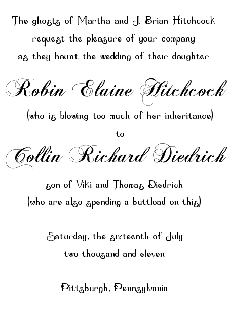
If our invitation were following etiquette rules and trying to be honest, it would end up saying something along the lines of
 This invitation wording obviously won’t do. I mean, for one thing it is too wordy! And while wedding invitations are supposed to tell you who is paying for the thing, but only after use of the Etiquette Decoder Ring that comes in boxes of Emily Post Cereal. This is far too straightforward.
So I think we’re gonna blow past that whole issue and use the “together with their families” wording. Which leaves open the question of how to END that sentence: “Together with their families Robin Hitchcock and Collin Diedrich…” do what now? Should we go with the staid “request the pleasure of your company” even though we’re already breaking from traditional invitation language? Do we try to “invite you to share in the joy and celebration” of our wedding, or something googedy like that?
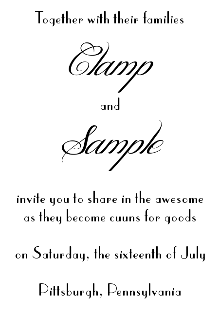
I asked Collin for his input on how to end the sentence, and here’s the invitation he drafted:
 Which frankly, I like a lot better. A few pushes in the direction of the English language and some additional details and that could be the perfect invitation. Except for the ghost of my grandmother terrifying me into believing that if I put the word “awesome” on my wedding invitation the even will lose all hope of grace and my marriage will be subsequently doomed.
ALSO: this entire post was a ruse to get you to comment on those fonts. And/or suggest excellent free fonts we can use for our invitations.


March 15, 2011 at 10:44 pm
I find it hard not to give my *unsolicited* opinion on fonts so here goes:
First mockup: love the script, not so much the fancy body font. I’m not a huge fan mostly for reasons of legibility though, and if you look at any collection of designer invites they’re clearly not designed to be legible. I’d pair the script with an equally-classy body font like Baskerville (I think it comes with Word? That or photoshop?) in small caps (where they’re all capitals, but the real capitals are bigger).
Second mockup: the body text is awesome, but have you faux-bolded it? It looks a little funky. It’s also got a fabulous art deco vibe, which is great if that’s what you’re going for, but if you’re going for garden party you might want to look elsewhere. I’d try pairing it with something equally modern, but maybe slightly less italic than the script you have there, like this: http://www.dafont.com/adorable.font
Yay fonts!
March 16, 2011 at 10:52 am
God bless you. This is exactly what I wanted! It looks a little funky because I changed the dimensions of the picture so it would fit on my blog (in proportion, but it was a .png file so changing anything can ruin everything). I worry that it looks TOO art deco… our venue is more Edwardian or Art Nouveau. I would love to capture THAT with our font selections without it being an illegible mess of swirls.
Also, I laughed and laughed at you defining small caps for me. I was on law review. Small caps are in my bones.
March 17, 2011 at 9:52 am
Haha, oopsie! The only think I know about law-related paper and print is the size of a legal pad. I love small caps!
I think the second one works for Edwardian art-nouveau, particularly with the names in script. Here are some free art nouveau fonts (http://www.fontspace.com/category/art+nouveau) if you’re interested in perusing, but I think the font you have is better than the classic art nouveau (with all the dips and swirls) because it’s easy to read, and looks a little more formal.
March 16, 2011 at 12:56 am
1) What Lizzie said.
2) Cuuns? Translation bitte? I could Google but am slightly afeard.
3) I will not tell your grandmother if you don’t.
4) I would die a death of awesome if I got an invitation in the mail with the first wording.
Nicely done!
March 16, 2011 at 10:53 am
“Cuun” is one of the many nonsense-word pet names Collin has for me. “Sample” is too, although I just realized it might look like lorem ipsum up there.
March 16, 2011 at 9:19 am
We went with “together with their families Bunny Lastname and Beagle Lastname invite you to join them in Chicago for their wedding.” Simple and straight to the point.
And yeah, what does cuuns mean? I’m so confused.
March 16, 2011 at 10:54 am
If Collin calls me “cuun” out of affection, it stand to reason (not really) that “cuuns for goods” are spouses.
March 16, 2011 at 11:55 am
First, for some reason, this post took FOREVER to load on my iPhone this morning, which just goes to show you that iPhones and iPads are NOT computers.
I agree with Lyn. If you changed “buttload” to “boatload,” I would be all over that first invitation, which captures your sense of humor perfectly.
As for fonts, I like the second set, but defer to Lizzie because we used ridiculous fonts that were probably all wrong, wrong, wrong, but I’m halfway through assembling the darned things so it’s too late now.
March 17, 2011 at 10:17 am
Hi! I just found you from APW… I’m really enjoying your blog!
Ditto the general theme above, and hoping you don’t have to use anything like my standby wording (which I didn’t have to use either actually) which went
“I haven’t seen you in years and can’t actually picture your face. I’m getting married on 23rd April 2011 to someone you’ve never met and probably never will. I’m obliged to invite you but please don’t come.”
Writing wedding invitations sucks.
March 17, 2011 at 11:42 am
I believe this is one of the hardest things to do when planning your wedding…I am not god with words.
March 17, 2011 at 11:59 am
I randomly found your blog after doing a Google search for The Knot’s “crazy color combos.” I like the blue/orange combo, but I also really like your blog! I’m so glad I found it! I’ve been struggling with the tension from being genuinely excited about our wedding day while not wanting to succumb to “wedding culture” and sacrifice my independent woman ideals, and it’s so nice to find a smart wedding blog that discusses girly stuff and real issues at the same time. Thanks! And now I’m off to read your archives…
March 17, 2011 at 1:49 pm
I am also from the Pittsburgh area (McKeesport), and the wording we went with was:
Lady Person and Guy Person
together with their families
invite you to join them for their marriage ceremony
We actually wanted Century Schoolbook font, but the printers that my mother decided on said they could only use this weird italic-scripty font which every invitation I have ever received has. Oh well, I didn’t want hassle, so I just went with the flow. As long as the information is out there, I’m happy no matter the font.
March 17, 2011 at 9:04 pm
“Etiquette Decoder Ring that comes in boxes of Emily Post Cereal” had me giggling for awhile.
Two links I’ve saved with guides to free fonts: http://www.drweb.de/magazin/35-hochwertige-freefonts/
http://www.uglygreenchair.com/archive/001219.html
Hope that helps!
March 18, 2011 at 2:25 pm
Free font solicitation! These are what we used, and they’re lovely. The pay for version has been broken into two parts (the main text and the swirly caps), so it’s a bit of a pain to use, but I wasn’t ABOUT to pay $70 for a font!
http://www.fonts101.com/fonts/view/Script/18928/Beautiful_ES.aspx
http://www.fonts101.com/fonts/view/Script/18927/Beautiful_Caps_ES.aspx
Enjoy!
February 16, 2015 at 12:39 am
Hi there, all is going sound here and ofcourse every one is sharing information, that’s truly good, keep up writing.
August 12, 2015 at 5:18 pm
If you are going for best contents like me, simply visit this web page daily for the reason that it provides
quality contents, thanks
August 31, 2015 at 9:28 pm
My partner and I stumbled over here different page and thought I should check things out.
I like what I see so now i am following you. Look forward to looking at your web page for a second
time.
August 31, 2015 at 9:32 pm
Appreciation to my father who stated to me about this webpage, this
web site is really amazing.